Dyslexia Canada
Branding
Dyslexia Canada is an award-winning national charity dedicated to ensuring every child with dyslexia has access to the support, resources, and advocacy they need to succeed. To mark its 10-year anniversary, the organization underwent a thoughtful brand evolution that modernized its visual identity while honouring the recognition and trust built over the past decade.
Designing for Lasting Change
Objective
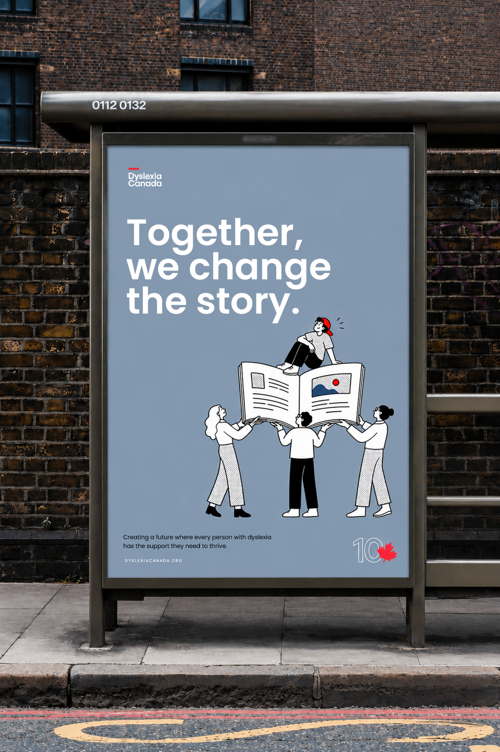
The goal was to refresh Dyslexia Canada's visual identity to better reflect its growth and impact over the past decade. The updated brand needed to feel approachable, credible, and optimistic while creating a flexible design system that could support educational resources, advocacy initiatives, fundraising, and digital communications.
Preserving Brand Equity

Logo construction
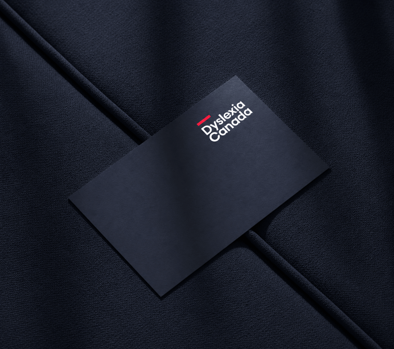
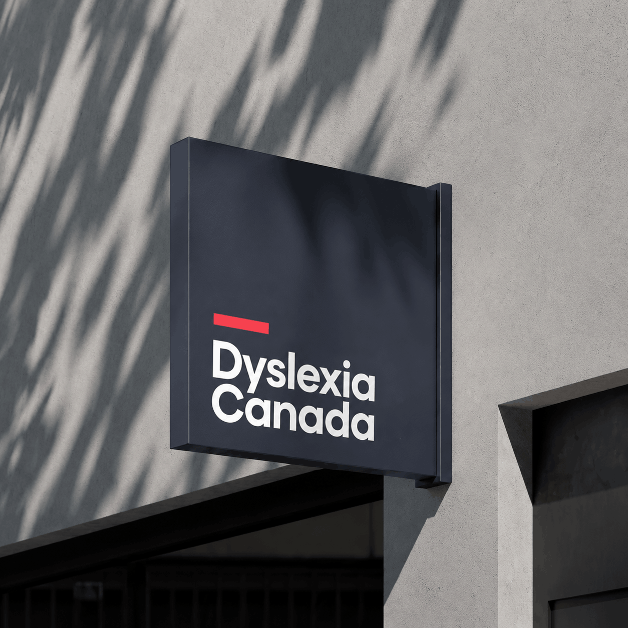
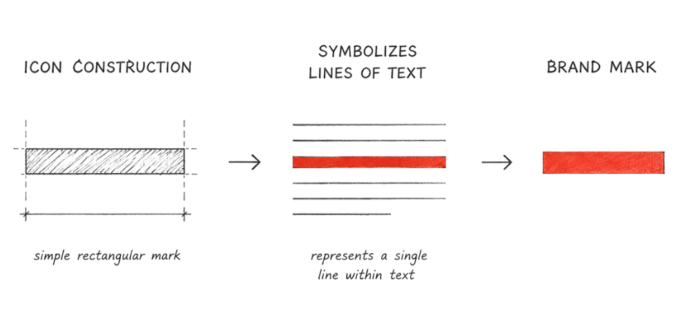
The line in the logo references the lines of text on a page, directly connecting the brand to reading, literacy, and learning. I originally designed this mark for Dyslexia Canada a decade ago, and over time it became one of the organization’s most recognizable visual elements. For the refresh, I chose to preserve it as a simple yet powerful piece of brand equity, maintaining continuity while allowing the broader identity to evolve.

Outcome
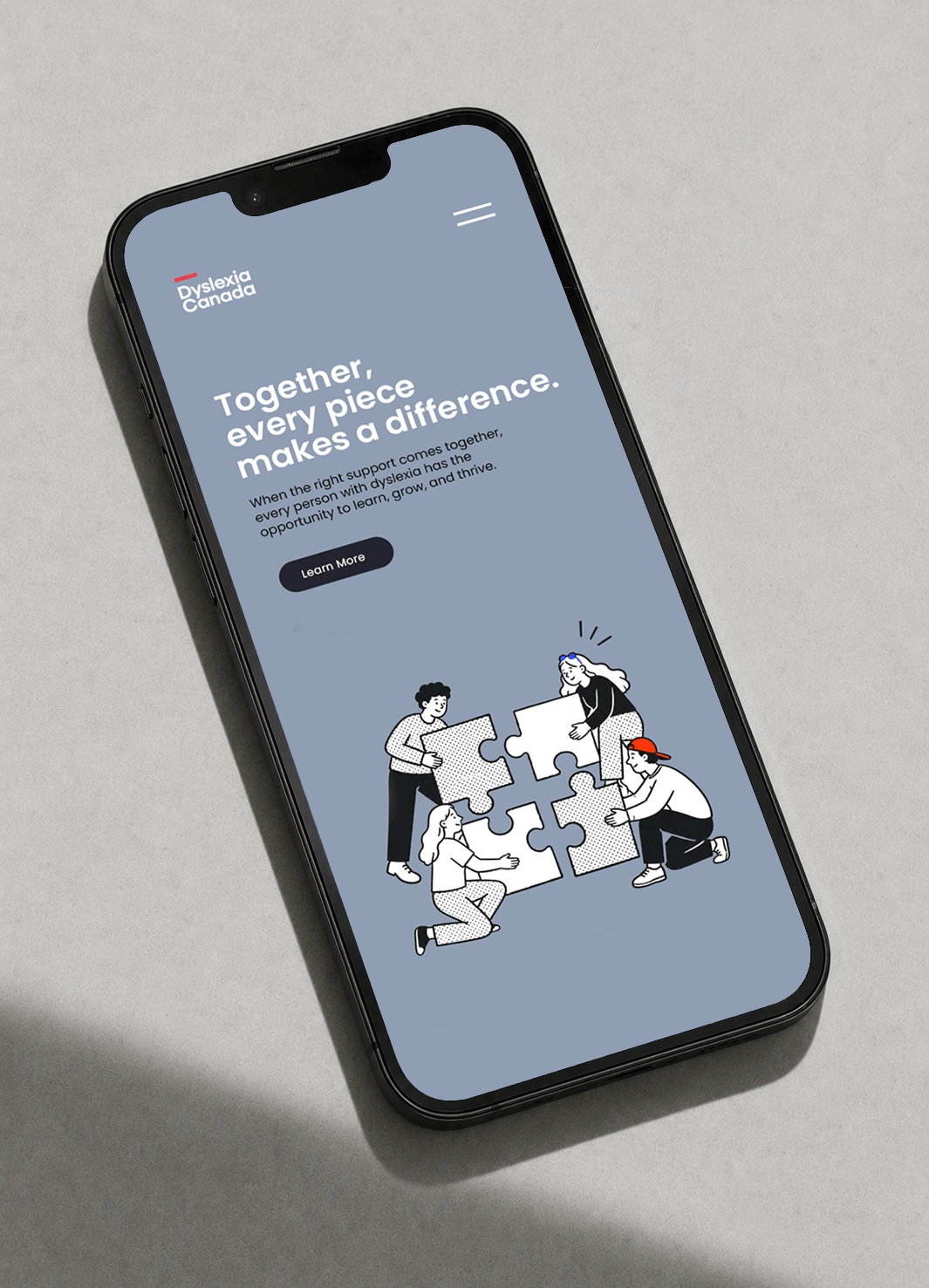
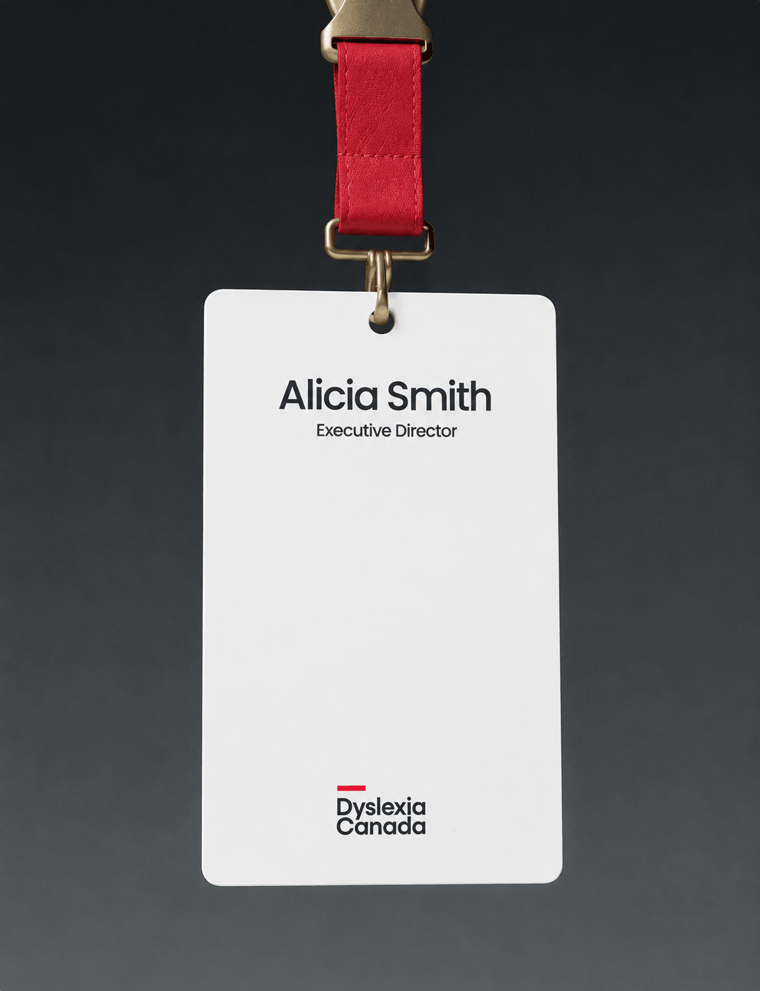
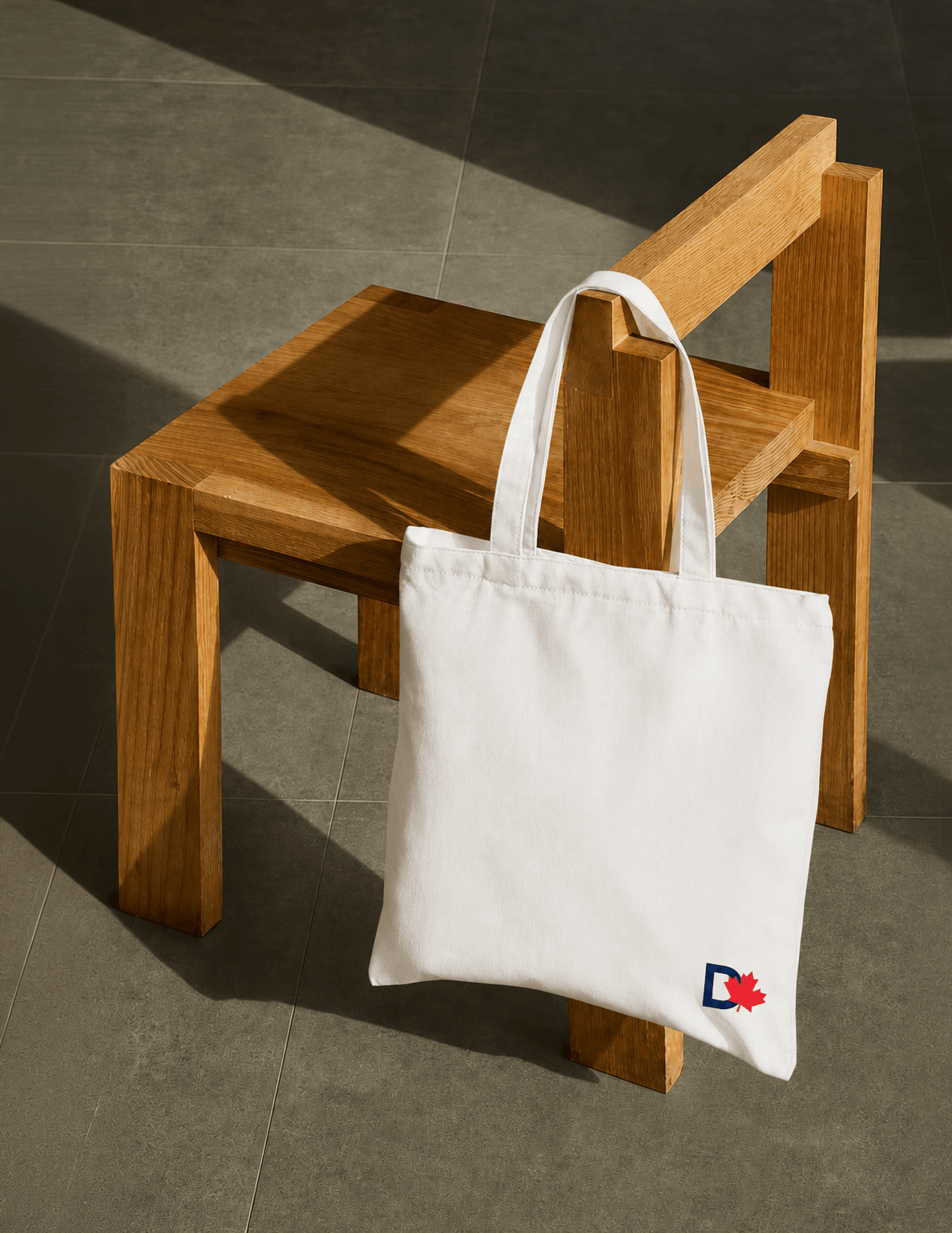
The project resulted in a comprehensive identity refresh, including an evolved logo system, anniversary marks, colour palette, typography, iconography, and a custom illustration library. Together, these elements create a cohesive visual language that extends seamlessly across print, digital, social media, presentations, and environmental applications while strengthening recognition and reinforcing Dyslexia Canada's mission.